
What The Charts Say: No Bull – The Evidence
By Tyler Durden
Sorry folks, it’s not a bull market. Not yet. The evidence I’ll outline indicates it may be too early to celebrate. I know the headlines are dominated by calls for new highs to come, a bull market in full swing ready to break out of a multi year consolidation. I’ve recently outlined the technical target should a sustained breakout indeed occur, but I’ve also outlined the structural bearish issues I see underlying the market.
Today I’m looking at the technical evidence that, so far, suggests that there is zero evidence to suggest that we are in a bull market. In fact it appears there is risk building that this is a completely broken market in its final inning. Yes we’ve had a massive rally off of the February lows, but the technical evidence is mounting that this may still be a bear market rally.
Why? Because key charts remain decisively bearish and any sizable pullback could literally kill any notion of a bull market.
Consider the actual evidence:
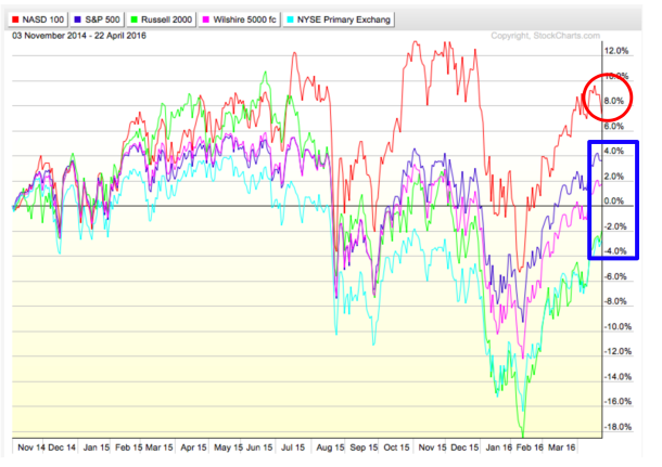
Since QE3 ended in October 2014 main markets in aggregate are in essence flat. Only the $NDX has shown any sizable gains, and advances have been driven by a few select mega cap stocks:
On this basis I have to ask: What bull market?
Note tech, the recent leader, may be on the verge of turning. While the latest sport is to ignore bad earnings key tech stocks are showing serious topping signs.
Let’s look at the $NDX in itself: This chart shows a potential heads and shoulders pattern of size with a broken wedge trend line to boot:
Note the declining RSI and the weakening MACD. New highs are made of this?
Perhaps the underlying individual stock patterns are bullish? Not really.
$MSFT: That recent high showed a massive negative divergence with what appears to be a rounding top and a false breakout:

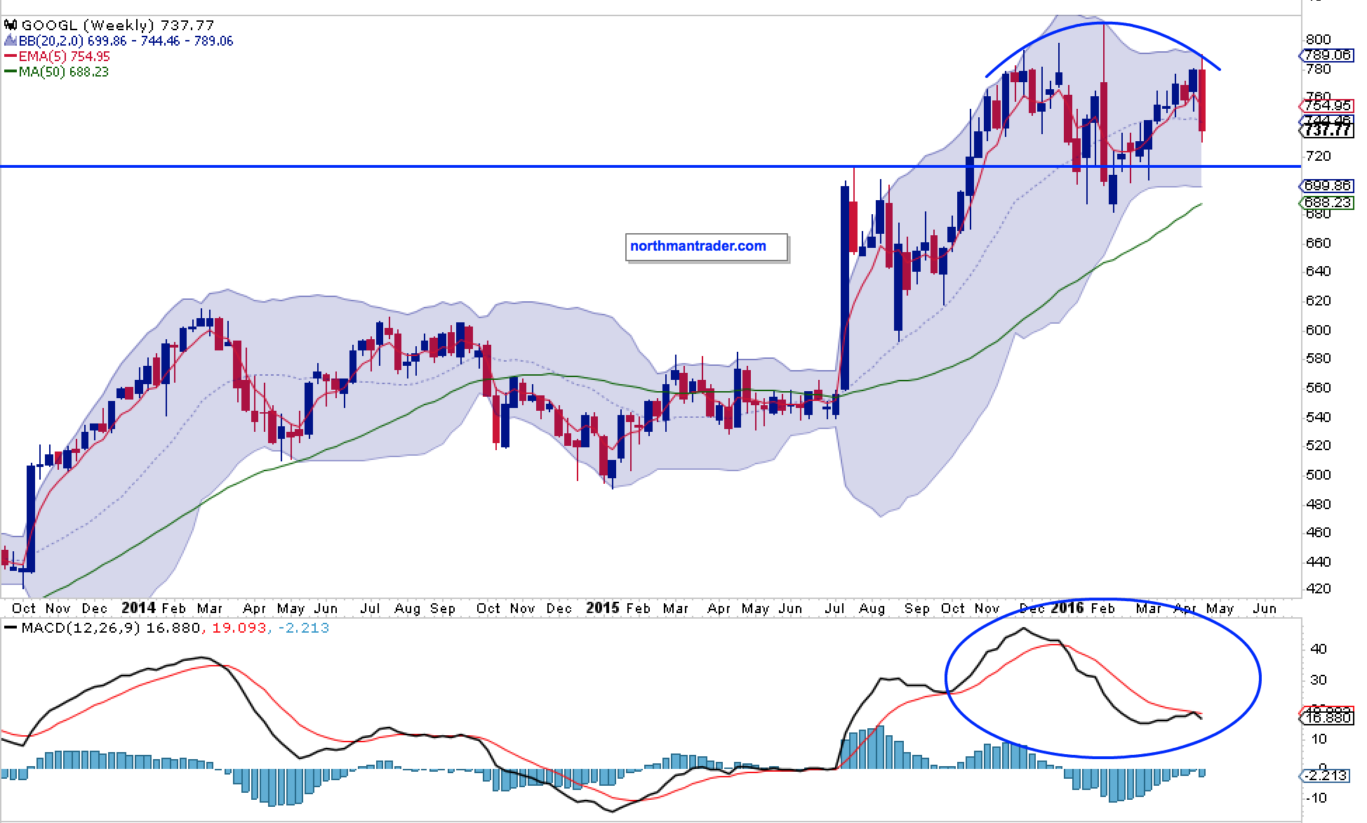
$GOOGL: A similar picture.
$NFLX: Potential heads & shoulders, with a bear flag, broken trend line and horrid MACD:

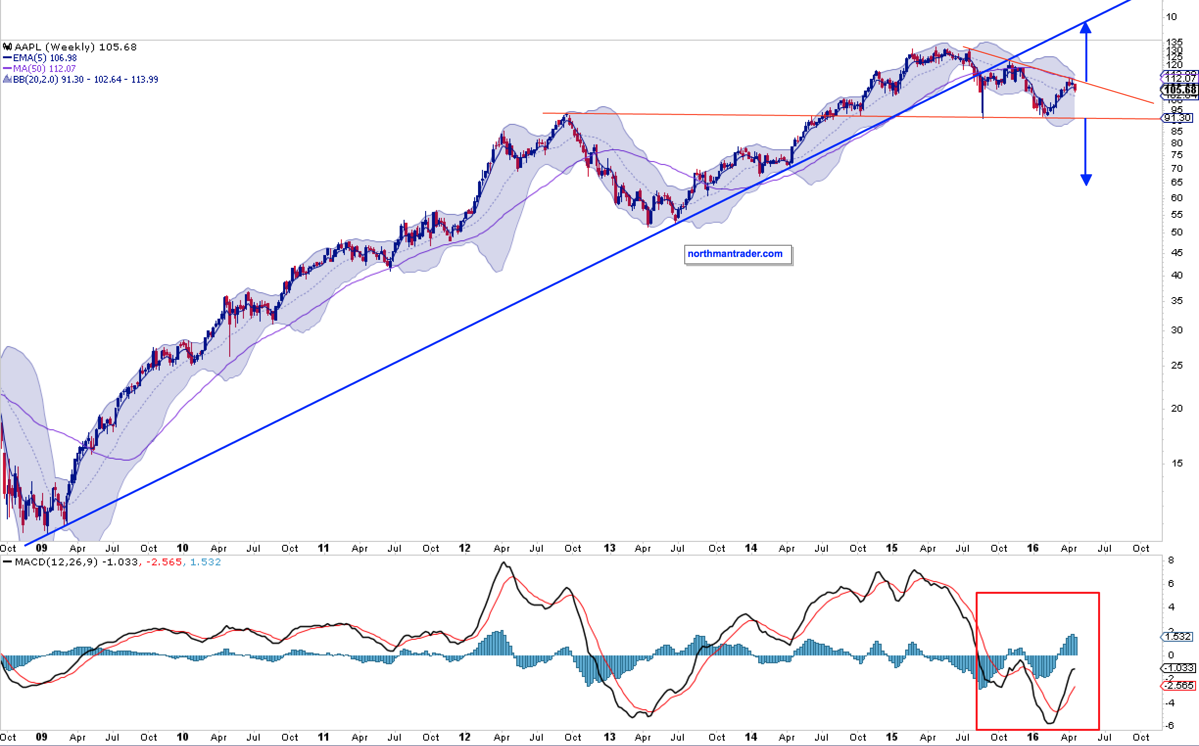
How about the flagship $AAPL? It could go either way I suppose based on the pattern below, but the trend line is also broken and the MACD is below the center line and recently we have seen lower highs. Will declining PC sales and a slowing smartphone market be the driver to new highs? Perhaps the upcoming earnings report next week will provide clarity:
In terms of mega cap leaders on the $NDX that leaves us with $AMZN and $FB.
$AMZN: The weekly Bollinger band is now flat and the MACD is showing massive relative weakness. Could it fly back up to the upper Bollinger band? Yes, but a negative divergence is then an almost certainty:

$FB, the most consistent stock out there has formed a multi-year wedge pattern and looks to be printing a …read more
Source: What The Charts Say: No Bull – The Evidence


